
Checkout is the point where customer intent becomes revenue—or disappears into abandonment. A shopper may have found the right product, accepted the price, reviewed the cart, and decided to buy, yet still leave when the final purchasing process becomes confusing, slow, demanding, unreliable, or unexpectedly expensive.
Checkout conversion optimization is the practice of removing unnecessary obstacles from that process while maintaining security, transparency, accessibility, payment reliability, and customer control.
Effective optimization is not about pushing customers into completing transactions they do not want. It is about helping qualified shoppers complete purchases they have already chosen to make.
That distinction matters. Hiding fees, creating artificial urgency, making cancellation difficult, or disguising optional purchases may increase certain short-term metrics, but these tactics can damage trust and create regulatory, support, and reputation problems.
Sustainable checkout optimization focuses instead on usability, accurate information, reliable technology, relevant payment choices, effective error recovery, and careful testing.
Checkout performance also varies considerably between audiences and businesses. Product complexity, device mix, traffic source, average order size, payment methods, fulfillment requirements, customer familiarity, fraud risk, and technical architecture can all influence results.
For that reason, businesses should measure their own checkout funnel rather than assuming a universal benchmark or copying another store’s design without testing it.
What Checkout Conversion Optimization Is
Checkout conversion optimization focuses specifically on increasing the proportion of shoppers who begin checkout and successfully complete their purchase. The goal is to identify unnecessary checkout friction and remove it without weakening payment security, creating misleading interfaces, or preventing customers from making informed choices.
A typical checkout flow includes customer identification, shipping information, delivery choices, billing information, payment details, authentication when required, order review, transaction authorization, and confirmation. Every additional decision, form field, page transition, error, delay, or unexpected cost introduces another opportunity for abandonment.
Several related metrics are often confused.
Checkout conversion rate measures how many shoppers who enter the defined checkout funnel ultimately purchase. If 800 checkout sessions begin and 520 result in confirmed orders, the checkout conversion rate is:
520 ÷ 800 × 100 = 65%
The percentage itself is meaningful only when the organization consistently defines what counts as a checkout start and a completed order.
Cart abandonment describes shoppers who add products to a cart but do not complete the purchase. Some of these shoppers may never begin checkout.
Checkout abandonment refers more specifically to shoppers who enter checkout but leave before completing the transaction.
Overall website conversion rate normally compares completed purchases with a broader population such as website sessions or users. It therefore includes product discovery, merchandising, navigation, traffic quality, and many other factors beyond checkout.
These distinctions help teams diagnose the right problem. If customers rarely add products to the cart, changing payment fields may accomplish little. If shoppers consistently reach payment but disappear after attempting authorization, payment checkout optimization deserves greater attention.
Checkout optimization should therefore be treated as part of the complete conversion funnel rather than an isolated design project.
How to Measure Checkout Conversion Rate and Funnel Performance

A useful optimization program begins with measurement. Without reliable baseline data, teams may spend time redesigning checkout elements that were not causing significant problems while overlooking payment failures, mobile errors, slow integrations, or confusing shipping calculations.
The basic checkout conversion rate formula is:
Completed purchases ÷ Checkout starts × 100
The important part is defining “checkout start” consistently. One business might count the moment someone opens the checkout page. Another might count the first completed checkout step. Either approach can work when the definition stays stable enough for meaningful comparisons.
Teams should monitor a collection of metrics rather than relying on one headline conversion number:
- Checkout starts
- Completed purchases
- Cart abandonment
- Checkout abandonment
- Payment failure rate
- Conversion by mobile, tablet, and desktop
- Payment-method usage
- Payment success rate by method
- Form-error rate
- Page load and interaction performance
- Time required to complete checkout
- Gateway error rate
- Decline rate
- Abandonment by checkout step
- Refund rate
Segmenting the data frequently reveals more than the overall average. A checkout may perform reasonably on desktop while creating substantial difficulties on smaller screens. Another business may find that one payment method generates disproportionate technical failures even though shoppers frequently select it.
Analyze the Entire Checkout Funnel
A useful checkout funnel can be modeled as:
- Cart
- Checkout start
- Shipping information
- Payment information
- Order review
- Payment authorization
- Confirmation
Measure movement between each stage. If a large proportion of customers disappear between shipping and payment, investigate shipping costs, delivery estimates, address requirements, or technical problems before redesigning the payment button.
If shoppers reach authorization but confirmation rates fall sharply, examine payment declines, gateway latency, authentication failures, callbacks, webhook handling, inventory checks, and duplicate-submission controls.
This stage-level approach turns “checkout abandonment is high” into an actionable question: where does abandonment happen, for whom, and under which conditions?
Identify Checkout Friction Before Redesigning the Experience
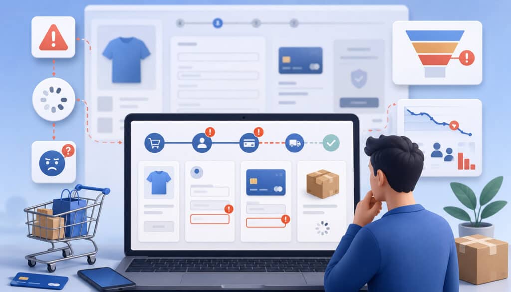
Checkout friction is anything that makes purchasing unnecessarily difficult, uncertain, slow, repetitive, or risky from the customer’s perspective. Some friction is necessary. A shipping business needs an address, a payment must be authorized, and certain transactions may require additional authentication.
The objective is not to eliminate every step. It is to distinguish necessary friction from accidental friction.
Common problems include:
- Too many form fields
- Mandatory registration
- Unexpected shipping charges
- Taxes or additional fees appearing late
- Slow-loading checkout pages
- Confusing validation messages
- Limited relevant payment methods
- Overly prominent coupon fields
- Poor layouts on smaller screens
- Failed payments without useful recovery options
- Unclear refund or return policies
- Security or privacy concerns
- Repeated requests for the same information
- Checkout sessions that expire unexpectedly
- Inventory changing without a clear explanation
Customer behavior provides clues. Repeated correction of the same form field suggests a form-design issue. A large payment-step drop may indicate payment failures or trust concerns. High mobile abandonment combined with desktop stability often justifies device-specific investigation.
A practical friction review should combine quantitative funnel analytics with qualitative evidence such as user testing, support conversations, surveys, error logs, and privacy-conscious session recordings.
Use Customer Evidence, Not Assumptions
Session recordings may reveal excessive scrolling, repeated taps, error loops, or users moving between checkout and shipping-information pages. However, sensitive payment information must never be captured inappropriately.
Payment fields, authentication details, security codes, and other protected information should be excluded or masked according to security and privacy requirements.
User testing can reveal problems analytics cannot explain. For example, analytics may show abandonment when shipping options appear. A usability session might reveal that customers do not understand whether “two-day delivery” means shipment within two days or arrival within two days.
Support teams can also identify repeated customer complaints about invalid promo codes, payment failures, confusing address rules, or unclear order totals.
Together, these sources help prioritize genuine checkout experience optimization rather than changes driven only by preference.
Guest Checkout, Account Creation, and Returning Customers
Mandatory account creation creates an additional commitment before customers can complete the transaction they originally intended to make. Registration may require passwords, account verification, additional consent decisions, or information unrelated to fulfilling the current order.
Offering guest checkout lets customers buy without completing those extra steps. This is especially useful for first-time shoppers who may not yet see value in creating an account.
The checkout should still collect information genuinely required for fulfillment, payment processing, receipts, fraud controls, or legally necessary records. Guest checkout does not mean anonymous checkout; it simply separates purchasing from mandatory membership.
A useful approach is to offer optional registration after the order has been confirmed. At that point, the customer has already completed the main task.
For example:
“Your order is confirmed. Create a password to save your delivery information for next time.”
This approach preserves convenience while still giving the business an opportunity to build a continuing customer relationship.
Improve Returning Customer Checkout
Returning shoppers can benefit from functionality that reduces repeated work, including:
- Saved delivery addresses
- Tokenized saved payment methods
- Express checkout
- Previous order information
- Preselected preferences where appropriate
- Secure account authentication
Saved payment credentials should normally rely on tokenization rather than unnecessary storage of raw payment data. Tokenization replaces sensitive account information with a reference that can be used within the approved payment environment, reducing direct exposure of payment credentials.
Guidance on payment security provides additional context on tokenization, access controls, and secure checkout architecture.
Convenience should never override account protection. Saved payment information increases the importance of secure authentication, session management, account recovery, and monitoring for unauthorized activity.
Simplify Checkout Forms and Reduce Repeated Data Entry

Checkout forms should ask only for information required to fulfill, process, secure, or properly document the transaction. Each additional field creates another potential error, decision, keyboard interaction, and validation failure.
Begin form optimization by auditing every field. Ask why it exists, who uses the information, whether it is necessary before payment, and whether the information is already available elsewhere.
Useful techniques include:
- Remove unnecessary optional fields.
- Use appropriate input types for email, phone, numeric, and other structured data.
- Apply sensible auto-formatting without preventing valid input.
- Enable browser autofill.
- Provide address suggestions where appropriate.
- Use smart defaults when the correct choice can reasonably be predicted.
- Place persistent, descriptive labels on fields.
- Validate information near the affected field.
- Arrange fields in a logical sequence.
- Reuse shipping information for billing when permitted.
- Avoid asking customers to enter the same information twice.
Established guidance for payment and address forms supports appropriate form semantics, autofill, labels, and input configuration. Autofill can be particularly useful during checkout because browsers may already have customer names, addresses, and payment-related information available for approved form fields.
Autofill, Address Validation, and Field Behavior
Address autocomplete can reduce typing, particularly on mobile devices, but suggestions must not prevent customers from entering legitimate addresses that the suggestion system does not recognize.
Postal-code validation, address suggestions, and formatting checks should therefore assist customers rather than trap them. Customers should be able to correct suggestions before submitting an order.
Mobile keyboards should match the expected input. An email field should make email entry convenient, while telephone or numeric fields should present suitable controls. Card-number inputs should not be implemented as generic numeric fields when doing so creates awkward browser behavior.
Inline validation should indicate problems when the customer can reasonably act on them. Displaying an error before someone has finished entering a value can create unnecessary noise.
One-Page vs. Multi-Step Checkout
There is no universal winner between one-page checkout and multi-step checkout. The appropriate structure depends on how much information customers need to provide, whether shipping and billing decisions are complex, the device environment, performance architecture, and customer expectations.
A one-page checkout presents most or all required information in one view. It can reduce page transitions and make the overall requirement immediately visible. For relatively simple orders, this can feel direct and efficient.
However, a long one-page checkout can become intimidating, particularly on smaller screens. Conditional shipping options, account controls, taxes, authentication, payment fields, and order summaries may create a long scrolling experience.
A multi-step checkout separates the process into logical stages, such as shipping, payment, and review. This can reduce the amount of information presented at once and may make complex transactions easier to understand.
The tradeoff is that additional steps can feel slow when navigation is poorly implemented, and customers may be uncertain about how much work remains.
One-Page and Multi-Step Checkout Comparison
| Factor | One-page checkout | Multi-step checkout |
| Complexity | Often suitable for simpler transactions | Can organize more complex requirements |
| Mobile usability | Works well when the page remains compact | Can reduce information shown at once |
| Progress visibility | Entire process may be visible together | Progress indicator can show remaining stages |
| Form length | May appear long | Splits fields into smaller groups |
| Loading behavior | Can reduce page transitions | Requires reliable step transitions |
| Customer expectations | Useful for familiar, straightforward purchases | Useful when shipping or payment decisions require explanation |
When using multiple steps, a progress indicator can reduce uncertainty. Labels such as Shipping → Payment → Review communicate where the customer is and what remains.
Avoid artificial steps created solely to make the checkout appear shorter. Every stage should have a functional reason to exist.
Optimize Mobile Checkout and Page Performance
Mobile checkout needs more than a desktop layout compressed onto a smaller screen. Customers may be typing with one hand, using a slower connection, switching applications during authentication, or purchasing while distracted.
Responsive layouts should preserve readable content and obvious actions without requiring zooming or horizontal scrolling. Form controls and buttons need comfortable tap areas, and important controls should not be crowded together.
Mobile checkout UX optimization should prioritize:
- Large, accessible tap targets
- Appropriate mobile keyboards
- Browser autofill
- Address autocomplete
- Digital wallets
- Minimal typing
- Fast loading and interaction
- Clear validation messages
- Responsive payment authentication
- Concise order summaries
- Sticky totals or checkout actions where they genuinely help
Sticky components require careful design. A permanently visible order summary may help customers confirm totals, but it should not consume so much screen space that the form becomes difficult to use.
Improve Checkout Page Speed
Checkout page optimization also depends on technical performance. Large images, inefficient scripts, excessive third-party tags, poorly optimized integrations, and unnecessary tracking can delay loading or make controls unresponsive.
Performance analysis should examine both initial page load and customer interaction. A checkout may display quickly but become sluggish when address lookup, shipping calculation, payment fields, or discount logic runs.
Developers should inventory every checkout dependency and ask whether each script needs to execute during payment. Marketing tags, chat tools, personalization systems, analytics scripts, and testing libraries can collectively create performance and security exposure.
However, do not remove security-critical scripts or fraud controls simply to improve a performance score. Test changes in an appropriate environment and evaluate their operational purpose first.
Modern performance tools can assess mobile and desktop loading behavior, while real-user monitoring can show how checkout behaves under actual devices and network conditions.
Show Total Costs, Shipping Choices, and Order Details Clearly
Unexpected charges create uncertainty at exactly the moment a customer is deciding whether to pay. Whenever practical, customers should understand the financial structure of the purchase before reaching the final authorization action.
The checkout should clearly present:
- Product subtotal
- Discounts
- Shipping charges
- Taxes
- Additional applicable fees
- Final payable amount
If a cost cannot be calculated until the customer provides additional information, explain that requirement instead of implying an incomplete amount is final.
Cost transparency is especially important around shipping. Customers should be able to understand available delivery speeds, estimated arrival information, prices, pickup options where offered, and any free-shipping threshold that legitimately applies.
A shipping option labeled only “standard” gives less useful information than one that includes price and meaningful delivery expectations.
Optimize the Order Summary
The order summary acts as a final accuracy check. It should clearly display:
- Product names or useful identifiers
- Quantity
- Item price
- Discounts
- Shipping
- Taxes
- Final total
- Delivery information where appropriate
Customers should be able to correct obvious mistakes without restarting checkout. If someone notices that the quantity is three instead of two, forcing that person to leave checkout, edit the cart, and re-enter shipping information creates avoidable friction.
The same principle applies when an item becomes unavailable during checkout. Explain what changed and preserve unaffected information wherever possible.
Checkout Conversion Optimization Techniques
| Technique | Friction it addresses | Potential benefit | Important consideration |
| Guest checkout | Forced registration | Faster path for first-time buyers | Offer account creation separately |
| Form simplification | Excessive typing and errors | Easier completion | Keep fields required for fulfillment or risk controls |
| Mobile optimization | Small controls and difficult typing | Better smaller-screen usability | Test across real device sizes |
| Express payments | Repeated address/payment entry | Reduced data entry | Confirm device and integration compatibility |
| Cost transparency | Surprise charges | Better purchase clarity | Calculate dynamic costs accurately |
| Error handling | Confusing failures | Easier recovery | Do not expose sensitive system details |
| Page-speed optimization | Waiting and unresponsive controls | More dependable checkout flow | Preserve security-critical functionality |
| Trust signals | Customer uncertainty | Greater confidence | Avoid fake badges or unsupported claims |
| Payment-method optimization | Missing or excessive payment choices | Better alignment with demand | Measure actual method usage |
Offer Relevant Payment Methods Without Creating Clutter
Customers differ in how they prefer to pay. Ecommerce checkout optimization should support payment methods that meaningfully serve the business’s customers while avoiding an overwhelming collection of rarely used choices.
Depending on the business model and customer needs, relevant methods may include:
- Credit and debit cards
- Digital wallets
- Electronic bank payments
- Buy-now-pay-later arrangements where appropriate
- Securely saved payment methods
- Payment links for suitable purchasing workflows
Payment-method optimization should be evidence-driven. Review selection rate, authorization success, customer requests, device type, order value, operating costs, fraud patterns, refund handling, and technical reliability.
Adding every technically available option can make the interface harder to scan and can increase development, testing, reconciliation, support, and maintenance work.
Digital Wallets and Express Checkout
Digital wallets and other express-payment experiences can reduce typing by reusing payment and delivery information that the customer has already stored in an approved environment.
This can be particularly useful on mobile devices, where entering long addresses and payment credentials is cumbersome.
However, wallet support still requires testing. Compatibility can differ by device, browser, customer setup, and payment configuration. Teams should verify successful payments, cancellations, authentication interruptions, address updates, shipping recalculation, duplicate interactions, and confirmation behavior.
Express payment also should not bypass critical order information. Customers still need access to accurate totals, delivery choices, applicable terms, and a meaningful confirmation of what they are purchasing.
Payment links can similarly be useful in some service, invoice, support, or remote-sales workflows. The key is to match the payment experience to the real customer journey rather than adding methods solely because they exist.
Payment Gateway Reliability, Declines, and Duplicate Protection
A visually excellent checkout cannot compensate for an unreliable transaction layer. Gateway latency, API errors, network timeouts, unavailable services, failed callbacks, and incorrect transaction-state handling can interrupt customers at the most important point in the funnel.
Teams responsible for payment conversion optimization should monitor technical payment performance separately from UX abandonment.
Useful operational indicators include:
- Payment API latency
- Authorization success
- Gateway error responses
- Timeout frequency
- Webhook delivery failures
- Transactions stuck in pending states
- Duplicate transaction attempts
- Payment success by method
- Decline patterns
A detailed payment gateway reliability resource can help teams think through monitoring, dependencies, failure handling, and incident preparation.
Handle Payment Declines Clearly
A declined payment should not lead to a dead end. The checkout should explain that the payment could not be completed and give the customer appropriate options without exposing sensitive issuer information or internal fraud rules.
Possible next actions include:
- Check entered payment information.
- Try an alternative eligible payment method.
- Correct an obvious billing-field problem.
- Return later if the problem appears temporary.
- Contact the relevant financial institution when appropriate.
Do not automatically repeat failed authorization attempts indefinitely. Uncontrolled retries may create duplicate transactions, trigger fraud controls, or produce a confusing customer experience.
A decline caused by invalid card data is different from a timeout where transaction status is uncertain. The application should distinguish known failures from unknown states.
Prevent Duplicate Orders and Charges
Duplicate prevention requires both interface controls and server-side safeguards.
A robust implementation may include:
- Assign a unique order or transaction reference.
- Use an idempotency mechanism for charge creation.
- Disable or clearly change the submit button after a valid submission.
- Verify transaction status server-side.
- Record processed webhook or callback identifiers.
- Treat network timeouts as uncertain until status is verified.
- Separate payment confirmation from unverified browser redirects.
Idempotency means that repeating the same intended operation does not create the same financial action twice. This is especially important when networks are unreliable or customers tap the payment button repeatedly.
Secure payment gateway integration guidance and independent payment integration security practices both emphasize server-side verification and careful transaction-state management.
Improve Checkout Errors and Preserve Customer Progress
Errors are inevitable. Addresses may be incomplete, promo codes may expire, inventory may change, authentication may fail, payment requests may time out, and sessions may become invalid.
The quality of the recovery experience often determines whether an error becomes abandonment.
Useful error messages answer three questions:
- What happened?
- Where is the problem?
- What can the customer do next?
For example, “Payment error” provides little direction. “We couldn’t complete this payment. Check the payment details or choose another payment method” is more useful while avoiding sensitive internal information.
Field-level errors should appear near the affected input and remain programmatically associated with it where appropriate. Error states should not depend on color alone. Accessibility guidance specifically emphasizes identifying errors and describing them so customers can understand what requires correction.
Preserve Customer Input After Correctable Errors
A customer who mistypes a postal code should not have to re-enter a name, email address, delivery address, and unrelated preferences.
Preserve non-sensitive information whenever it can be retained securely. This includes appropriate customer details, delivery selections, order quantities, and other inputs unaffected by the error.
Sensitive payment credentials require more careful handling. Do not retain or repopulate sensitive information in ways that conflict with payment-security or compliance obligations. Secure hosted fields and tokenized payment flows may allow the payment environment to manage appropriate information without exposing raw credentials to the merchant application.
Expired sessions deserve special attention. If security requirements force the checkout session to end, communicate what happened and restore the cart or other safe information where possible.
Common error categories worth designing separately include:
- Invalid form fields
- Incorrect addresses
- Invalid or expired discounts
- Inventory changes
- Declined payments
- Authentication failures
- Network problems
- Gateway timeouts
- Expired sessions
Build Trust While Maintaining Payment Security
Trust signals are useful when they answer genuine customer questions. A cluttered checkout filled with badges, warnings, countdowns, pop-ups, promotional banners, and unsupported security statements can have the opposite effect.
Relevant trust information may include:
- Secure-checkout messaging
- Accessible privacy information
- Clear return and refund policies
- Customer-support access
- Transparent order totals
- Recognizable payment-method indicators
- Accurate delivery information
Trust should come primarily from predictable behavior. Secure connections, stable pages, correct totals, understandable policies, reliable payment confirmation, and professional error handling are more meaningful than decorative security claims.
Payment Security and Conversion
Secure checkout design typically involves multiple layers, including HTTPS, tokenization, secure payment forms, appropriate authentication, fraud controls, access management, and responsible handling of payment data.
PCI DSS establishes payment-account-data protection requirements that apply according to how a merchant stores, processes, or transmits card information.
Businesses should understand their specific responsibilities rather than assuming that using an external payment service eliminates all obligations. Official payment security resources explain responsibilities for card-present and card-not-present environments.
Security controls should be designed carefully because excessive friction can also affect legitimate shoppers. Requiring every customer to complete unnecessary verification, for example, can make the checkout harder without proportionate benefit.
Fraud Prevention Without Excessive Friction
Fraud prevention may combine:
- Address checks
- Security-code validation
- Device and behavioral signals
- Velocity controls
- Transaction monitoring
- Risk-based authentication
- Step-up verification
- Manual review
Controls should be calibrated using actual risk patterns. Rules that are too permissive allow unnecessary fraud exposure, while overly aggressive rules can decline legitimate transactions and damage payment conversion.
Additional customer authentication may sometimes be triggered by the payment environment or transaction risk. When authentication occurs, provide clear instructions, responsive screens, reliable redirects, and safe recovery when customers cancel or authentication fails.
Security and checkout conversion should therefore be managed together rather than treated as opposing objectives.
Coupon Codes, Shipping Details, Subscriptions, and International Checkout
A promo-code field seems harmless but can influence behavior. A large empty box labeled “Coupon Code” may signal to customers that they are missing a discount, encouraging them to leave checkout and search elsewhere.
Businesses should test whether the field needs to be permanently prominent. Alternatives include a collapsible “Have a promo code?” control or contextually displaying the field to customers arriving through promotions.
The goal is not to hide legitimate discounts. Customers who possess a valid code should be able to find and use it without difficulty.
Invalid-code messages should explain whether the code is expired, incompatible with the cart, incorrectly entered, or otherwise unavailable when that information can be safely disclosed.
Checkout for Subscription Payments
Subscription checkout requires information beyond the immediate payment because the customer is agreeing to future billing.
Clearly communicate:
- Billing frequency
- Amount or method for determining future charges
- Trial conditions where applicable
- Renewal terms
- Stored-credential treatment
- Cancellation information
- Recurring-payment authorization
Do not rely on subtle formatting to hide recurring obligations. Customers should understand what happens after the initial transaction.
Tokenized credentials can support future authorized payments while reducing direct handling of raw card information, but technical implementation should be aligned with applicable payment rules and security responsibilities.
Checkout for International Customers
Cross-border checkout introduces additional variables, including currency, address structures, languages, taxes, payment availability, shipping restrictions, delivery expectations, and transaction-routing considerations.
Avoid forcing every customer into one address format. Some regions use different postal-code structures, address ordering, administrative divisions, and telephone-number formats.
Currency display should also be clear. Customers need to understand the currency in which they will actually be charged and whether displayed estimates differ from the final payment amount.
Payment-method demand can vary considerably across markets, so analyze customer usage rather than assuming the same method mix works everywhere.
Accessibility, Browser Testing, and Checkout Quality Assurance
Accessibility is part of checkout usability, not a separate decorative enhancement. Customers must be able to understand, navigate, complete, and correct the transaction using different input methods and assistive technologies.
Important considerations include:
- Keyboard navigation
- Proper screen-reader labels
- Sufficient text and control contrast
- Clearly identified errors
- Logical focus order
- Accessible buttons and controls
- Visible focus indicators
- Error messages that do not rely on color alone
Form labels should communicate the purpose of their controls, and errors should be associated with the fields requiring attention. Established form accessibility guidance offers practical patterns for labels, instructions, validation, and notifications.
Accessibility obligations and technical interpretations can vary by context. Businesses with legal or compliance questions should obtain qualified guidance appropriate to their circumstances rather than treating a general optimization article as legal advice.
Cross-Browser and Device Testing
A checkout that works on one developer’s laptop has not been adequately tested.
Quality assurance should cover:
- Desktop devices
- Mobile phones
- Tablets
- Major browsers
- Different screen dimensions
- Portrait and landscape orientation where relevant
- Slow or unstable network conditions
- Touch and keyboard navigation
- Autofill behavior
- Authentication redirects
Browser updates and payment integrations can change behavior, so testing should continue after launch.
Checkout testing should include more than successful purchases. Test:
- Successful payments
- Declined payments
- Invalid card information
- Expired sessions
- Incorrect addresses
- Invalid promo codes
- Gateway timeouts
- Duplicate clicks
- Inventory changes
- Mobile checkout
- Wallet transactions
- Authentication cancellation
- Refund-related order data
A payment API integration overview can help nontechnical teams understand how API requests and responses connect checkout interfaces with payment infrastructure.
A/B Testing and Checkout Research
Checkout conversion optimization techniques should be evaluated through controlled measurement rather than intuition alone. A change that appears simpler to a design team may confuse customers, move problems to another stage, or improve one metric while harming another.
Begin with a hypothesis.
For example:
Hypothesis: Making the optional promo-code field collapsible will reduce unnecessary exits from the payment step because fewer customers will leave checkout to search for discounts.
Then define what will determine whether the hypothesis is supported.
A testing plan may include:
- Primary metric: checkout conversion rate
- Secondary metric: promo-code usage
- Guardrail metric: support complaints or order-value changes
- Relevant segments: mobile and desktop
- Test duration and sample requirements
- Predefined decision criteria
Where practical, test one meaningful change at a time. Changing form length, shipping presentation, payment buttons, colors, and page structure simultaneously may produce a result without revealing which change caused it.
Avoid Premature Conclusions
Small samples can produce unstable outcomes. So can unusually strong promotions, temporary technical incidents, traffic-source changes, or shifts in product mix.
Teams should determine sample requirements and analysis methods appropriate to their traffic and experimental design rather than stopping a test when an early result looks favorable.
Also examine guardrail metrics. Suppose a new express checkout increases completed orders but also creates a spike in duplicate orders or customer-service contacts. The headline conversion metric does not capture the complete effect.
Not every improvement requires an A/B test. Severe bugs, inaccessible controls, incorrect totals, broken validation, security vulnerabilities, and duplicate-charge defects should generally be fixed rather than intentionally left in place merely to preserve an experiment.
Session Recordings, Customer Research, and Checkout Analytics
Analytics explains what happened. Customer research can help explain why.
Useful research sources include:
- Moderated or unmoderated user testing
- Post-purchase surveys
- Abandonment surveys used carefully
- Customer-support feedback
- Funnel analytics
- Privacy-conscious session recordings
- Application and gateway error logs
Session recording systems require strict configuration around checkout. Sensitive payment fields, authentication values, credentials, and protected personal information must not be captured inappropriately. Review recording, analytics, and third-party script configurations as part of payment security.
Customer-support information is particularly useful because recurring questions often identify unclear policies or interaction problems. Ten different tickets asking where to enter an apartment number, for example, may indicate a field-label or address-structure issue.
Checkout Analytics That Matter
A practical checkout dashboard may include:
- Checkout conversion rate
- Payment success rate
- Form-error rate
- Abandonment by step
- Conversion by device
- Conversion by payment method
- Time to complete checkout
- Gateway error rate
- Decline rate
- Authentication completion
- Refund rate
Avoid declaring a metric “good” or “bad” solely because it differs from a generic industry figure. Your own historical results, customer segments, technical changes, traffic sources, and transaction characteristics provide more useful context.
When a metric changes, investigate correlated indicators. A lower checkout conversion rate combined with a sharp increase in gateway timeouts suggests a different response than lower conversion combined with a sudden increase in shipping-step exits.
Measurement should lead to diagnosis, not just reporting.
Cart and Checkout Recovery
Not every abandoned checkout represents a lost customer. Some shoppers become distracted, change devices, wait for additional information, encounter temporary payment problems, or intentionally postpone the purchase.
Appropriate recovery mechanisms can make returning easier.
Useful options include:
- Saved carts
- Returning-session recovery
- Reminder messages where permission and applicable requirements allow
- Customer-service assistance
- Clear payment-retry instructions
- Persistent non-sensitive checkout information
Recovery should remain respectful. Excessive messages, misleading countdowns, fabricated scarcity, or repeated pressure can damage trust and create a poor customer experience.
If payment failed, recovery messages should reflect the actual transaction state. Never tell a customer that an order failed until the payment system has confirmed that outcome. A network timeout can leave the merchant application uncertain while the authorization continues elsewhere.
Before inviting the customer to try again, verify whether the original transaction succeeded, failed, or remains pending. This protects against duplicate charges.
Common Checkout Problems and Recommended Fixes
Checkout optimization becomes more manageable when teams connect observable problems to testable causes and measurable improvements.
Common Checkout Problems and Recommended Fixes
| Checkout problem | Possible cause | Recommended improvement | Metric to monitor |
| High checkout-start abandonment | Mandatory registration or long form | Offer guest checkout and remove unnecessary fields | Checkout completion by new customers |
| Mobile users exit early | Difficult layout or excessive typing | Improve responsiveness, autofill, and tap targets | Mobile checkout conversion |
| Drop after shipping step | Unexpected cost or unclear delivery | Show shipping price and delivery information earlier | Shipping-step abandonment |
| Frequent form errors | Poor labels or restrictive validation | Improve field structure and inline feedback | Form-error rate |
| Payment-step abandonment | Declines or technical failures | Improve decline recovery and payment reliability | Payment success rate |
| Duplicate orders | Repeated submissions or retry logic | Add idempotency and server-side status checks | Duplicate transaction count |
| Slow checkout | Heavy scripts or integrations | Audit dependencies and optimize performance | Load and interaction performance |
| Customers leave to find discounts | Prominent empty coupon field | Test a collapsible promo-code control | Checkout exits near promo field |
| Failed sessions lose progress | Weak session recovery | Preserve safe checkout information | Recovery completion rate |
| Customers question security | Unclear policies or unexpected redirects | Improve trust information and payment-flow consistency | Support contacts and payment abandonment |
The table should be used as a diagnostic starting point, not as a universal prescription. One checkout may have several overlapping causes.
For example, poor mobile payment conversion might originate from small controls, but it could also result from authentication redirects that fail to return customers correctly. Investigation should therefore connect UX observations with payment and application logs.
Common Checkout Optimization Mistakes
Checkout optimization fails when teams focus on superficial changes while ignoring customer needs, system reliability, and measurement.
Common mistakes include:
- Forcing customers to create accounts.
- Asking for information that is not genuinely needed.
- Revealing shipping, taxes, or fees only near final payment.
- Adding too many payment choices without measuring demand.
- Designing primarily for desktop.
- Returning vague error messages.
- Clearing useful customer information after a correctable error.
- Filling checkout with navigation, advertisements, or unrelated promotions.
- Creating fake urgency or scarcity.
- Making return, renewal, or cancellation information difficult to find.
- Removing necessary security controls merely to shorten checkout.
- Testing only successful payments.
- Launching changes without baseline measurement.
- Assuming a tactic that works for another business will work for every audience.
Another common mistake is treating checkout conversion rate as the only metric that matters. A design that creates more completed orders but also increases fraud, duplicate charges, refunds, accessibility failures, or support workload is not necessarily an improvement.
Teams should therefore define both success metrics and guardrails before making significant changes.
Keep Optimization Customer-Centered
A useful question for every proposed change is:
Does this make it easier for a customer who already wants to purchase to understand, complete, and trust the transaction?
If the answer depends on confusing the customer, hiding information, creating artificial pressure, or making an unwanted action difficult, the tactic does not belong in a trustworthy checkout optimization program.
Good checkout UX optimization aligns customer and business interests: fewer errors, clearer information, reliable payments, easier completion, and better understanding of the transaction.
Checkout Conversion Optimization Checklist
A structured checklist helps teams move from scattered ideas to a repeatable improvement process.
- Measure the current checkout funnel. Establish checkout starts, completed orders, abandonment stages, payment success, errors, device differences, and performance.
- Identify the largest friction points. Use analytics, support feedback, usability testing, logs, and appropriate session analysis.
- Enable guest checkout where appropriate. Keep account creation optional unless the business model genuinely requires an account.
- Remove unnecessary fields. Request information needed for fulfillment, payment, risk management, or legitimate operational purposes.
- Improve mobile usability. Test typing, autofill, tap targets, scrolling, validation, payment methods, and authentication.
- Show total costs clearly. Present shipping, taxes, discounts, applicable fees, and the final payable amount as early as practical.
- Offer relevant payment methods. Match the selection to customer demand rather than displaying every possible option.
- Improve payment error handling. Give customers useful recovery choices without revealing sensitive decline or fraud details.
- Protect against duplicate transactions. Use unique references, idempotency, submission controls, status verification, and reliable webhook handling.
- Improve page performance. Audit scripts, images, tracking tools, and integration latency without removing required security controls.
- Maintain strong security. Protect payment information through appropriate encryption, tokenization, authentication, access control, and fraud monitoring.
- Test across devices and browsers. Include slower networks, multiple screen dimensions, assistive technology, mobile wallets, and authentication flows.
- Monitor gateway reliability. Track latency, errors, timeouts, webhook failures, payment status, and service incidents.
- Run controlled experiments. Start with clear hypotheses and evaluate primary, secondary, and guardrail metrics.
- Review customer feedback. Combine analytics with support conversations, surveys, user testing, and error evidence.
- Measure results and iterate. Checkout experience optimization is an ongoing process because customer behavior, payment methods, fraud patterns, devices, and technical dependencies change.
Frequently Asked Questions
What is checkout conversion optimization?
Checkout conversion optimization is the process of helping shoppers who begin checkout complete their intended purchase with fewer unnecessary obstacles.
It includes UX improvements such as shorter forms, guest checkout, mobile usability, cost transparency, and useful error messages, as well as technical improvements such as reliable payment processing, duplicate prevention, authentication handling, and page performance.
The goal is not to pressure reluctant customers into buying. Effective checkout optimization removes preventable friction while protecting security, accessibility, transparency, and customer choice.
How is the checkout conversion rate calculated?
A basic calculation divides completed purchases by checkout starts and multiplies the result by 100. For example, if 500 checkout sessions begin and 350 orders are successfully completed, the checkout conversion rate is 70%.
The business must define “checkout start” consistently. If the event definition changes during an experiment, comparisons may become unreliable. Teams should also analyze supporting metrics such as payment success, device conversion, form errors, and abandonment by step.
What causes customers to abandon checkout?
Checkout abandonment can result from many factors, including unexpected costs, forced account creation, long forms, confusing delivery information, poor mobile design, slow pages, payment failures, missing payment methods, trust concerns, invalid discounts, or unclear error messages.
Some abandonment is intentional and cannot reasonably be eliminated. Customers may reconsider the purchase or become distracted. The most useful approach is to measure abandonment by checkout stage and combine analytics with customer research and technical logs.
Does guest checkout improve conversion?
Guest checkout can remove the extra work associated with mandatory registration, making it easier for first-time or occasional customers to complete a transaction.
However, businesses should measure their own results rather than assume a guaranteed effect. Some business models genuinely depend on customer accounts.
Where accounts are useful but not essential before payment, a practical approach is to complete the purchase first and then offer optional account creation afterward.
Is a one-page checkout better than a multi-step checkout?
Neither approach is universally superior.
One-page checkout can work well when relatively little information is required and the interface remains easy to scan. Multi-step checkout may work better when customers need to make several shipping, billing, payment, or review decisions.
The correct choice depends on transaction complexity, mobile experience, loading architecture, customer expectations, accessibility, and testing results. The structure matters less than whether customers understand what is required and can progress without unnecessary friction.
How can mobile checkout be improved?
Start by reducing typing. Support browser autofill, appropriate keyboard types, address suggestions, digital wallets, reusable customer information, and concise forms.
Use responsive layouts with accessible tap targets and keep important totals, validation messages, and payment actions easy to find. Test authentication redirects and external payment flows carefully because customers may temporarily leave the browser or change applications.
Performance should also be evaluated under realistic mobile-network and device conditions.
Which payment methods should checkout offer?
The most useful payment methods are those that customers actually want and the business can operate reliably. Depending on customer demand, this may include cards, digital wallets, electronic bank payments, saved methods, installment arrangements, or payment links.
More options are not automatically better. Every method adds integration, testing, reconciliation, support, security, and operational requirements. Analyze selection rates and payment success before expanding or removing options.
How do payment declines affect checkout conversion?
A payment decline occurs after a customer has demonstrated strong purchase intent, so poor decline handling can turn a potentially recoverable transaction into abandonment.
When appropriate, provide a non-sensitive explanation and allow customers to correct payment information or choose another payment method. Never disclose internal fraud logic or sensitive issuer information.
Systems must also distinguish definite declines from ambiguous network failures. When transaction status is uncertain, verify it before encouraging another payment attempt.
Can page speed affect checkout completion?
Performance can affect whether customers can interact reliably with checkout. Slow pages, delayed scripts, unresponsive controls, payment-field loading problems, or timeouts may create frustration or prevent transactions from progressing.
Performance optimization should examine images, scripts, third-party tools, tracking, shipping calculations, address services, payment integrations, and other dependencies.
Security-critical functionality should not be removed casually to improve speed. Test performance changes while preserving the protections required by the checkout environment.
How should checkout changes be A/B tested?
Begin with a specific hypothesis and decide which metric will determine success. Add secondary and guardrail metrics so an apparent improvement in conversion does not hide problems such as increased errors, refunds, fraud, or support contacts.
Test one meaningful change at a time where practical. Determine suitable sample requirements before drawing conclusions, and account for traffic-source or promotional changes that could distort results.
Critical fixes involving security, incorrect totals, duplicate charging, accessibility, or broken checkout functionality generally should not be deliberately left unfixed simply to maintain an experiment.
How can businesses reduce checkout errors?
Start by determining which errors occur most frequently. Improve field labels, use appropriate input controls, accept reasonable input formats, add autofill, provide address assistance, and display useful validation near the affected field. For payment and network errors, preserve safe customer information and provide an appropriate recovery path.
Technical teams should also inspect server logs, gateway responses, webhook processing, authentication results, and application errors. Some problems that appear to customers as “checkout errors” actually originate in backend payment or inventory systems.
Which checkout metrics should businesses monitor?
Useful metrics include checkout conversion rate, payment success rate, abandonment by step, form-error rate, device-specific conversion, payment-method performance, time to checkout, decline rate, gateway errors, authentication completion, and refunds.
The correct dashboard depends on the business model. Avoid using universal benchmarks as the sole definition of success. Compare performance with your own historical data, customer segments, device mix, traffic sources, transaction characteristics, and documented product changes.
Conclusion
Checkout conversion optimization works best when businesses focus on helping customers complete transactions they already intend to make.
That means removing unnecessary fields, offering guest checkout where appropriate, improving mobile usability, displaying costs clearly, providing relevant payment methods, maintaining reliable payment infrastructure, and giving customers useful ways to recover from errors.
Technical reliability deserves the same attention as visual design. Gateway failures, duplicate submissions, poor transaction-state handling, slow integrations, and broken authentication can undermine even an attractive checkout.
Security, accessibility, fraud prevention, and transparency also remain essential. Faster checkout should not require weaker payment controls, misleading pricing, hidden obligations, inaccessible interfaces, or manipulative design.
The strongest approach is continuous and evidence-based: measure the funnel, identify the largest friction points, make focused improvements, test across real devices and failure conditions, evaluate results, listen to customers, and iterate.
When ecommerce checkout optimization combines simple forms, transparent costs, relevant payment choices, mobile usability, reliable processing, effective error handling, controlled testing, and ongoing measurement, checkout becomes easier to complete without sacrificing the safeguards and customer trust that sustainable commerce requires.